Sunday, 8 January 2012

What I Wore - Print Dress to a Christmas Party

On Christmas Eve my husband and I were invited to a friend’s birthday at Mirage, a Russian restaurant. I thought it was a great opportunity to wear my new dress that I had bought at Century 21 in New York back in August but hadn’t had the chance to wear yet.

I’m very particular when it comes to purchasing dresses. I found that frills, soft fabrics, floral patterns, wide collars, puffed sleeves and pastels - in other words, all that is described as romantic - are not for me. I prefer dresses with clean cut lines, and if it’s not black then the print should be quite distinctive and strong but not too loud. My other dress rule is that it can’t be overly expensive nor does it have to reflect the latest trend. This way I know I’ll be able wear the dress for more than just one season. For example, look at Diane von Furstenberg wrap dress: it’s been around for over 40 years and is still going strong; it’s an icon, really. So when I saw this dress, I instantly fell in love with it. Upon returning home to Australia I showed the dress to my eldest daughter asking for her opinion on it, she was terribly disappointed when she learned that I'd never heard of the designer, Martin Margiela. I' quickly made a point to look him up. 

According to https://www.net-a-porter.com/ (yes, it is a valid source of information!):


“Belgian-born Martin Margiela worked for Jean Paul Gaultier before launching his own label in 1988. A leader of contemporary style, the elusive designer - who has famously never appeared on the runway or in photographs - has now handed the creative reins over to an in-house design team that continues to push the boundaries between art and fashion with its avant-garde creations.

I love the simplicity of the cut, the way it hugs the body in the right places and the pattern of big, dark blue and maroon on white background. But what makes it really stand out from the crowd is the clever use of white lines to separate the coloured squares. They could have been left as they are but instead, peppered here and there are words, numbers and symbols - very innovative. The other great thing about it the dress is that you can wear almost any colour shoes with it. I was debating between white and red and ended up going with metallic red and purple strappy stilletos. I am a strong believer in that good shoes have the power to bring to life an outfit; no matter how expensive or beautiful your clothes are, wear the wrong shoes and you’ve blown it.

To complete the ensemble I added a purple Vivenne Westwood handbag I bought at Harrod’s. She is such an iconic women, I wish I could be like her.

Finally, a pop of red lipstick to tie it all together!

Dress: Martin Margiela
Shoes: from France
Bag: Vivenne Westwood

Friday, 6 January 2012

Lazy summer lunch

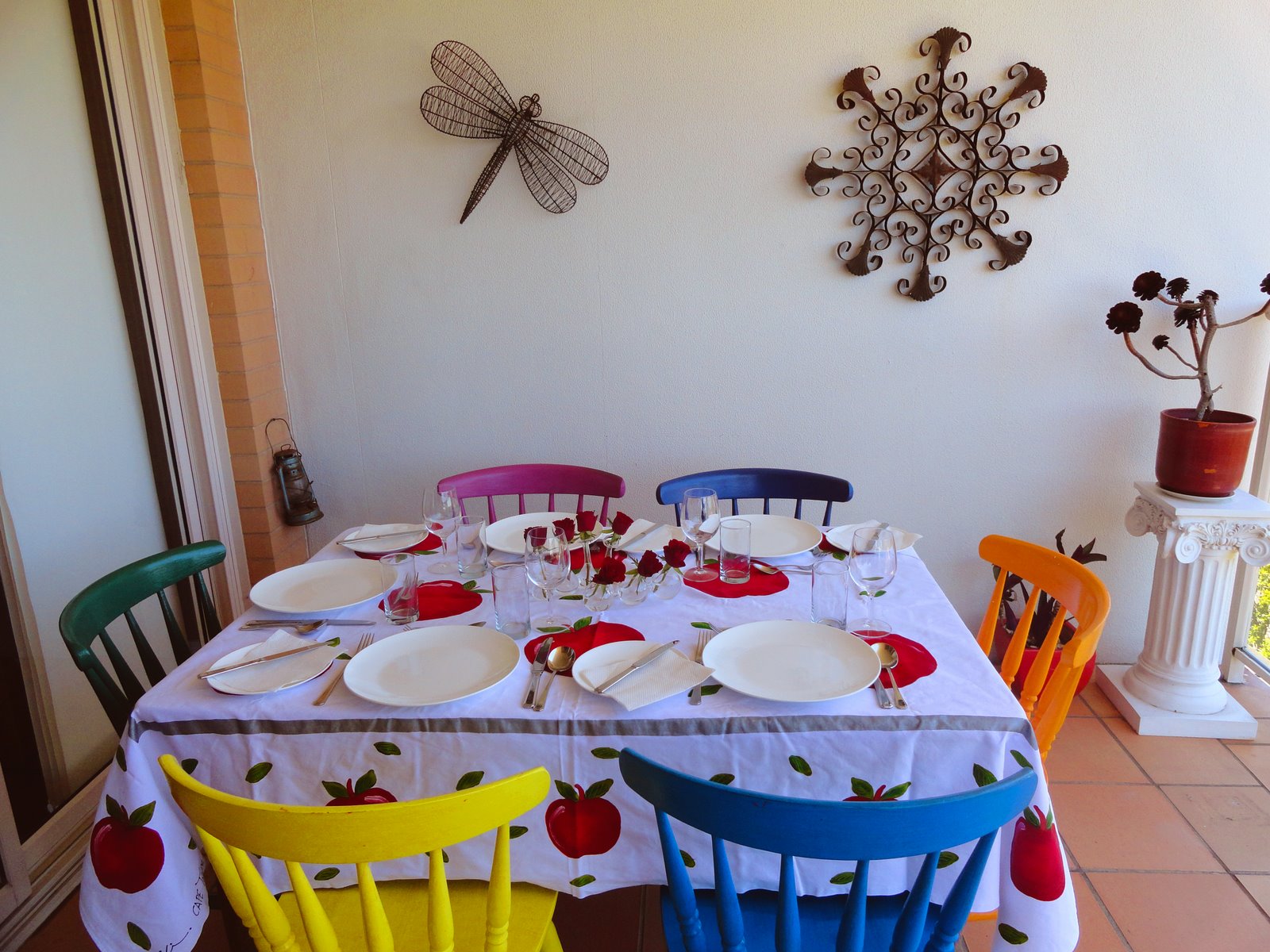
Last Sunday we invited my husband’s friends for lunch. The friendship goes way back to the days when my husband lived in South Africa, and he was very excited when the couple contacted him here in Sydney. Between allergies and the plethora of choices people make in terms of what they do and don't eat, you have to be very careful about what you cook for guests. In this case, it turned out that one of my guests was a pescaterian, but apart from that there were no other dietary restrictions. Did I mention that it's currently summer in Australia and it was a perfect day to have lunch alfresco? To impress my guests I covered the table with a tablecloth my mother-in-law bought for me in Cape Town; it's white with red apples painted over it.

The colourful chairs were another DIY project of mine. They were originally plain, untreated pine wood that looked pretty boring to me so I bought six small sample pots in different colour paints and painted them. 


Menu
Cold Gazpacho soup
Smoked salmon roulade
Watermelon salad with feta cheese and herbs
Home made hummus
Asian-style cabbage salad
Fresh fruit
Wine: Pieroth Blue 2007 Kreuznacher Kronenberg Nahe 2007

If you wanted to add a hot dish to this menu, you could easily cook the Asian-infused Barramundi from one of my previous posts.  If you wanted to splurge a little more, you could place fresh oysters or prawns on your table.

As I started preparing the soup an interesting thought came to mind: according to colour psychology red is the colour of fire and blood, so it is associated with energy, war, danger, strength, power and determination, as well as passion, desire, and love. Red is a very emotionally intense colour; it enhances the  human metabolism, increases the respiration rate and raises blood pressure. Yet almost every dish on my cold summer menu was red...

Gazpacho 
When I made this soup for the very first time (not sure if I can use the word “cook” since there is no cooking involved), the recipe I chose called for fresh tomatoes. As this fruit is perpetually quite expensive in Australia - $4/kilo at least - and they all need to be peeled, I decided to cut corners by buying canned tomatoes instead! Everyone always likes the soup anyway so I continue to use tinned tomatoes instead of fresh.


You need (for 8 people):
2 x 400g tinned peeled tomatoes (your preferred brand)

2 x red capsicum, cut into chunks

1 x medium cucumber, peeled and cut into chunks

1 x medium Spanish onion (red!)

2 x garlic cloves (but I adore garlic and so I use four or five instead)

2 TBS Extra virgin olive oil

1 TBS red wine vinegar

Sea salt and freshly ground black pepper

A drop or two of red Tabasco sauce (optional)

A handful of basil or parsley leaves (optional)

Place all the ingredients in a food processor and blitz to your desired consistency - I like it smooth but with a bit of texture. Check the seasoning and adjust to your taste. If you feel that the soup is rather thick, add a bit of warm water.

If you and your guests are feeling a bit adventurous, add a splash of vodka to the soup. Serve cold with sprinkles of chopped basil or parsley and a drizzle of extra virgin olive oil. Serve with warm, crusty bread.

Watermelon Salad with Feta and Herbs
The first time I ate this salad was in Bali at a very cool restaurant in Seminyak called KU DE TA. The combination of the sweet watermelon, the salty feta and the heat from the chilies was very unusual and worked well with all the other dishes we had there.


You need:
1/4 x ripe watermelon (keep it refrigerated until the last moment)

100 grams x goat cheese or feta (whichever takes your fancy)

A bunch of coriander leaves

1 x Spanish onion (red)

A bunch of mint leaves

A sprinkle of dried red chili flakes (if you like the heat)

Extra virgin olive oil

Sea salt and freshly ground black pepper

Remove the watermelon skin from its flesh, cut the fruit into chunks approximately 2cm x 2cm in size - try to make them not too small as they will lose their liquid and become mushy. Crumble in the cheese and finely sliced red onion. Add in the chopped herbs, salt and pepper and give it all a toss.  Do not work it too hard, try to keep it crisp and cold.

Hummus
This is great as a dip on its own or as an accompaniment to a meat dish, spread on flat bread. The beauty of this version is that if you don’t have chickpeas, other legumes such as cannelloni beans work just as well.

You need:
1 x 400 gram can of chickpeas

3 TBS tahini (found in the Kosher or Health Food section in your supermarket)

1 tsp sumac (or, if you don’t have this on your spice rack, a squeeze of lemon juice and 1 tsp paprika are a good substitute)

2-3 cloves of garlic (as I told you before, I adore garlic)

Salt and pepper

Drain the chickpeas but save the liquid.  Place all the ingredients into a food processor and blitz until smooth. Check the seasoning and adjust according to your taste. If the paste looks too thick, add the reserved liquid, another spoonful of olive oil and one more of tahini. Blitz again.

Place the paste into a bowl, make a well in the middle, drizzle with olive oil and sprinkle with paprika to serve.

                       Sweet and Sour Cabbage Salad with Slivered Almonds

This salad is another versatile dish that can be served just as an entree/side dish or add shredded chicken to it and you have a lunch dish.

You need (for 8 people):
1/2 x white cabbage or Chinese cabbage

4 sprigs green onion

1/2 packet fried noodles (you will find them in the Asian section of your supermarket)

3 TBS toasted slivered almonds

Olive oil

White wine vinegar

Caster sugar

Soy sauce

Use a big, deep bowl that will allow you to mix the salad easily. Finely shred the cabbage, finely slice the onions, combine, toss in the almonds and mix.

For the dressing
Pour around 6 TBS vinegar, 4 TBS olive oil, 3 TBS soy sauce and 2 TBS caster sugar into a screw top jar, give it a good shake and taste. You should be able to taste some heat, sweetness and sourness all at once. I suggest using regular olive oil rather than extra virgin. Make sure you have enough dressing as the cabbage will soak most of it up; about 150 grams. Adjust the ingredients to your taste but bear in mind that it’s meant to be a sweet and sour salad so you'd want both of those flavours.

Pour the dressing over the salad, give it all a good mix and sprinkle with the fried noodles just before serving as they become soggy very fast.  When serving, scoop from the bottom of the dish where the dressing is.

Also, do not forget that fresh vegetables cut into bite size pieces, sprinkled with your favourite dressing is an all time winner, as well as being eye catching and a major time saver!


The beauty of these dishes is that they are all served cold and are delightfully refreshing on hot days. Also, most of the preparation can be done in advance with minimum effort and they all taste just as good the next day!

Saturday, 24 December 2011

Tuesday, 20 December 2011

Christmas at The Society inc.

Yesterday I paid a visit to one of my favourite stores, Sibella Court's The Society inc. in Paddington. Overflowing with delightful handmade treasures from all over, I always find the shop so inspiring.

Full of Christmas cheer, there were glitter origami, felted unicorn, paper flowers and other gorgeous bits and pieces to give this festive season a much-needed injection of sparkle and colour in the face of the awful weather Sydney has been experiencing.


Sunday, 18 December 2011

Red: A DIY Story

Recently I wrote about the power of the colour red. This time I wanted to share with you how to seamlessly thread this strong hue into your decor.


I like to follow the 60:30:10 rule: when choosing colours for a room, stick to three because this is enough to make it interesting without clashing or confusing. Then, rather than using equal amounts of each colour, divide them into 60%, 30% and 10%. The main colour should cover around 60% of the space i.e. the walls, add 30% of the second colour i.e. major furniture pieces and flooring, and the final 10% is a third colour that brings the whole scheme together and creates accents where you want them. In my case, that colour is red.


There are a lot of ways to introduce the accent colour into your existing decor.  You can start slowly, on a small scale with maybe just a photo frame on your nightstand and then add a little more in the form of decorative boxes stacked beside it.


Fresh flowers are the most obvious and easiest way to bringing colour into your home.


But, if you're a little more adventurous and into DIYs, here are a few projects of mine in which I used red.


When my daughter requested extra room for her ever-growing book collection, I thought I'd go for something other than the traditional bookshelf. What I ended up buying is a leaning bathroom storage unit from BednBath that was originally white. By painting it a vermillion colour and adding some little treasures for a personal touches, the shelf not only provides some much-needed storage but also makes a point of interest out of an otherwise utilitarian landing space. 


This project was born when we bought this funky sculpture made by a friend of ours, Toni Pinkus. The challenge here was to find the perfect stand that was in the step with the sculpture, would be a statement piece on its own but not overpowering the artwork, thereby achieving harmony between the two pieces. Consideration had to be given to the proportion, colour and style of the stand. Finally, everything had to be in sync with the existing decor of the living room space.

After unsuccessfully browsing the net for hours, I decided to go with a design of my own. As I wanted to involve my husband in the project, I had to come up with something that could be created by somebody who wasn’t a handyman by trade but did know his way around a hammer and nail. I chose a U-shape and determined the size of the vertical part of the structure by applying that centuries-old nugget loved by artists of all times, the golden ratio, 1:3.

As for the colour, using the same 60:30:10 rule, I chose red again so as to add contrast to the room’s otherwise neutral colour palette and to create a focal point.

Armed with measurements and a sketch, we made a trip to our local timber yard where we purchased cut-to-measure wood, strong glue and nails. Next stop was the art and craft supplies store where I purchased red acrylic paint and a roller brush. The rest, as they say, is history. 


These bowls were bought over numerous trips to South Africa, at Greenmarket Square in Cape Town. Made by people from the township, the bowls are papier-mache using a variety of wrappers from sardines, matchboxes etc. Because they’re made out of paper, the bowls don’t have much use other than as receptacles for peanut, which nobody in my family likes anyway. But, remembering the quip from the Freedom Furniture ads, “think outside the square you live in”, I was inspired to mount the bowls on a blank canvas that I had lying around in the storage room. Lacking red paint, I instead covered the canvas in red tissue paper saved from a Mother’s Day present. Then I simply glued the bowls on top of the papered canvas and hung it on the wall. The result was more interesting and effective than I had expected; the contrast between the red, yellow and blue and the repetition of the sardines and other fish draws the eye every time. I can't help but smile when as I watch guests trying to figure out what they're actually looking that.

When it comes to being creative, anything and everything goes!

Thursday, 15 December 2011

Who Framed Who?

Hi All,

You may have noticed that I changed the picture in my header. I really like this arrangement and wanted to share it with you.

As promised, this post is about a recent DIY project of mine: framing and hanging a photo gallery. There are two things that led me to this idea:  1) I recently completed a graphic design course where I learnt my way around Adobe InDesign, Illustrator and Photoshop. Some of you might smile and think, “Where has this person been in the last 10 years and how has she survived without using these tools?” Well, finally equipped and dangerous, I decided to put my newly-acquired skills to the test. And, when it comes to interior decorating, there’s no better guinea pig than your own home; 2) my home is split into two levels with both walls leading up the staircase blank except for one painting hung at the bottom of the stairs.

So, I decided to create a photo gallery on one of the walls. I have to be up front – this is not an easy task. It takes time and patience to put together a collection of images that are not only interesting but also complement the existing décor.

I started with only six frames so that if it worked out well, I could add more as I went along and became more adventurous.

 The one painting already hanging on the wall is monochromatic with a yellow accent. Applying the elements and principles of design, I took inspiration from this colour scheme and chose white paint for the frames with a matching grey mat (or mount). I should mention to you that I love picture frames and strongly believe you can frame almost anything, transforming the most trivial everyday object into a statement piece. But that’s a topic for another post.

Original wall

I also wanted to add some character and texture to the frames. I achieved this by giving them a light scrub with sand paper and slapping some grey paint here and there.


Next, I selected the pictures my family and our guests wouldn’t mind seeing as often as they climb up and down the stairs. Family photos were my original idea but I decided against it because: a) these are already displayed enough in our bedrooms; b) both my husband and I think such photos are a private affair and c) I wanted to be able to utilise Photoshop tools.  After screening hundreds of saved images, I settled on those that highlighted the places we’d visited over the years and dream of seeing again.

Despite being an absolute Photoshop amateur, I had a lot of fun adjusting the pictures, mostly using the Image and Filter tools. To my surprise, the effects were quite stunning, my favourite being one of the Brooklyn Bridge with the colours inverted.


The last part of the project proved to be the trickiest: positioning the frames. I strongly recommend cutting a newspaper to the same size as your frame and using something like Blu-Tack (that’s a removable adhesive for you non-Antipodeans) to attach it the wall. Take a step back, take a photo and walk away.  The following day, have another look at the arrangement with fresh, focused eyes. I also suggest viewing the photos on your computer so that you can have a closer look without losing perspective nor having to crane your neck!

Work in Progress

As they say, a picture is worth a thousand words.  So please take a look and I would love to know what you think!


Job's done!


Saturday, 3 December 2011

From Riches to rags

Hi All,

I have done it again, I have completely neglected my faithful readers and for that I apologise.

On the other hand, I have been busy with a few projects that I will share with you in my next post, and it is not an empty promise, truly.

But for now, I would like to continue to share with you some more photos from my trip to the US of A. This lot represents some very funny and some downright crazy shop fronts and signs.

 Louis Vuitton window display


 Ice cream at Tiffany, anyone?

 Harlem


 Only in America


 Why not, indeed?


 Not for the faint hearted


 My favourite


 No dog, no entry


 Warm welcome!


What can I get you - a bra, perhaps?


Time warp


Hope you found these photos as amusing as I did.  Til next time...